Undergraduate Assistant | Black Communication and Technology Lab
Redesigning the BCaT website to strengthen brand recognition, usability and site performance
The TLDR;
PROBLEM
The Black Communication and Technology Lab— an organization for Black Studies, Digital Humanities, and more— lacked a functional, brand-driven website.
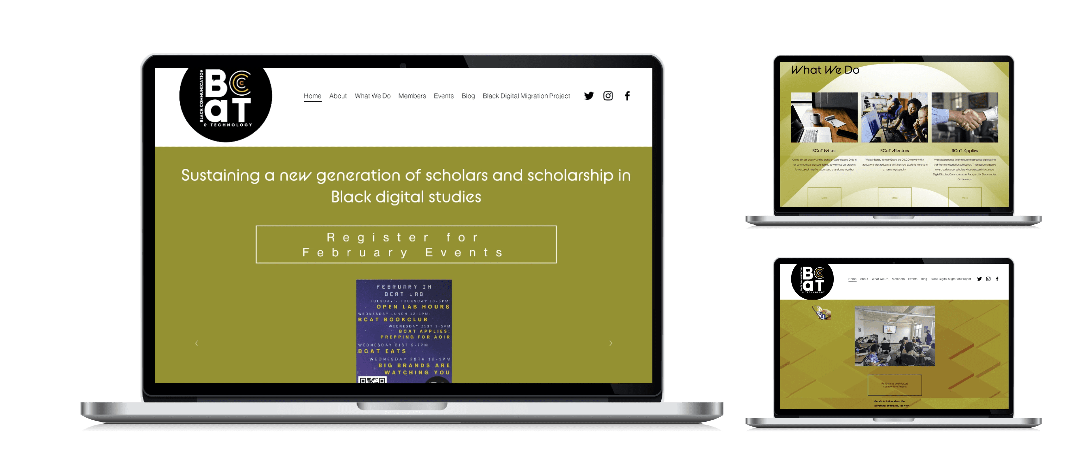
There were a lot of pain points that dampened the user experience: inaccessible text, information hidden within confusing sections, inconsistences in fonts, colors, and text sizes, and information overload. Not to mention, it lacked a connection to the brand as a whole.
How might we:
ensure consistency and findability throughout our website?
SOLUTION
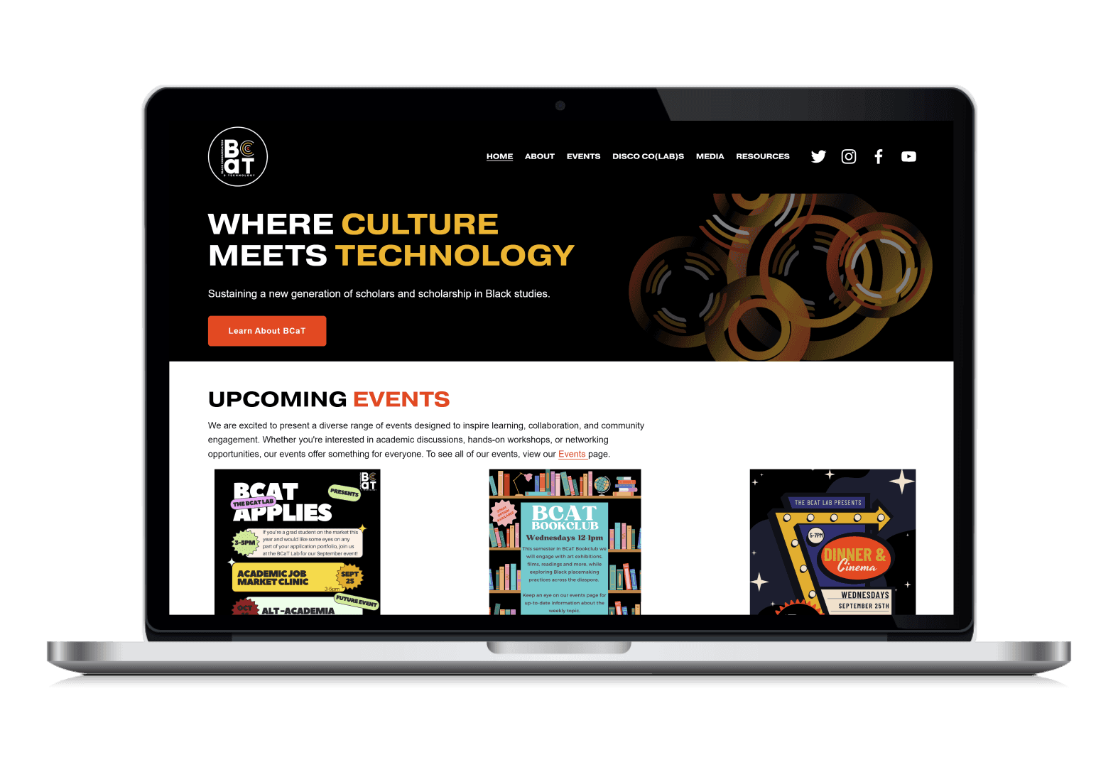
A website redesign that focuses on enhancing functionality and brand-recognition!
In February 2024, I was hired and tasked with redesigning BCaT’s entire website and information architecture by May 2024. My redesign would focus on addressing usability heuristic issues and incorporating BCaT's brand throughout the site.

HOW?
Collaborating with lab directors, conducting a usability heuristic evaluation, and leading usability testing helped me pinpoint functional errors and find additional opportunities for improvement pre and post-launch.
SO WHAT?
My redesign increased user satisfaction and site performance, with site visits boosting by 70%.
We jumped from 1.7k site visits last year to ~2.4k site visits in less than a year to date! Within that same time frame, our page views boosted from 3.5k last year to 6.1k today.

Our site analytics as of October 24th, 2024
Discovery
What was wrong with the previous site design?
The old site design lacked consistency, simplicity, and a connection to the brand.
APPROACH #1
I conducted a website audit and heuristic evaluation.
I found numerous issues pertaining to the organization of information, readability, and overall accessibility of the site. I mapped these inconsistencies out and brought them to stakeholders for additional feedback and consensus.
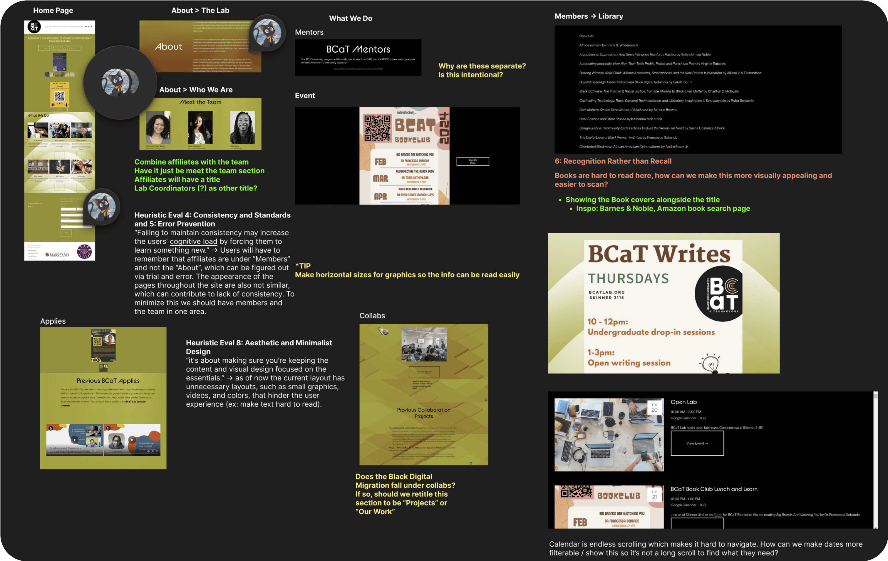
I referenced the 10 Usability Heuristics for User Interface Design to pinpoint prominent issues with the previous site design.
APPROACH #2
I connected with three lab directors to discuss goals for the redesign
I used our meeting as a way to uncover the director's pain points and hopes for the site overhaul. After our discussion, we developed these 3 redesign goals that would be my north star:
REDESIGN GOALS
Branding and design should connect to the logo
We want to increase our brand recognition throughout the site and beyond
Simple navigation
We want to make it easier for users to find what they need
Clear language and CTAs
We want to mitigate any confusion about resource information
Let’s get to work!
Ideation
Setting the foundation for a rebrand
I created mood boards to visualize how BCaT's brand identity could expand
MOOD BOARD
With BCaT’s brand leaning towards bold and modern, I found sites with similar feels and noted how they ordered information and maintained consistency.
This also helped me figure out how to utilize brand colors throughout the site in a way that improved accessibility and clarity for our users.
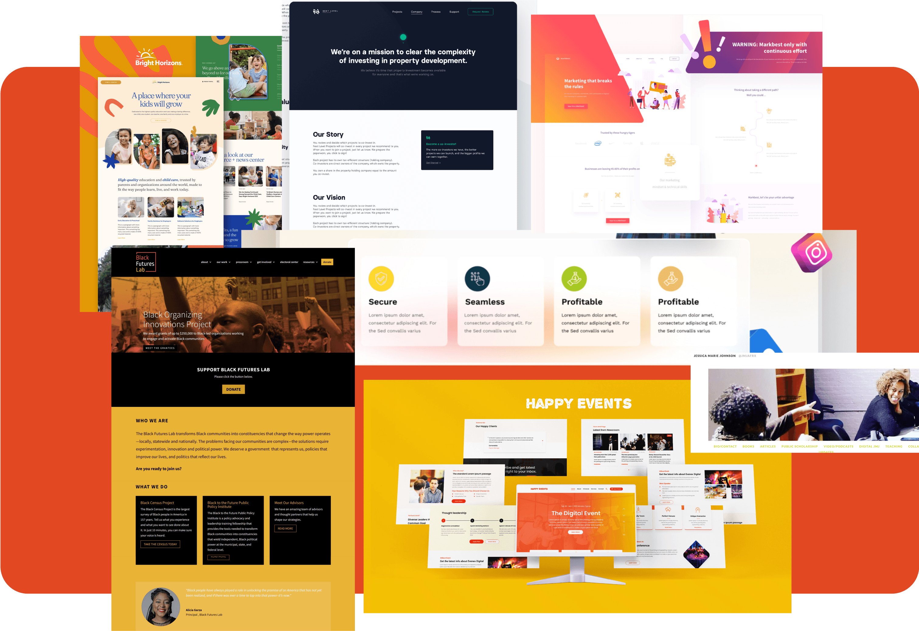
The mood board I came up with and shared with stakeholders.
Reimagining the information architecture to increase findability
IMPROVING NAVIGATION
I created site maps in order to address the navigation issues and lack of clarity users have faced.
I brought the reimagined site map to the team to see if they had new content they were considering adding to the site.
Original:
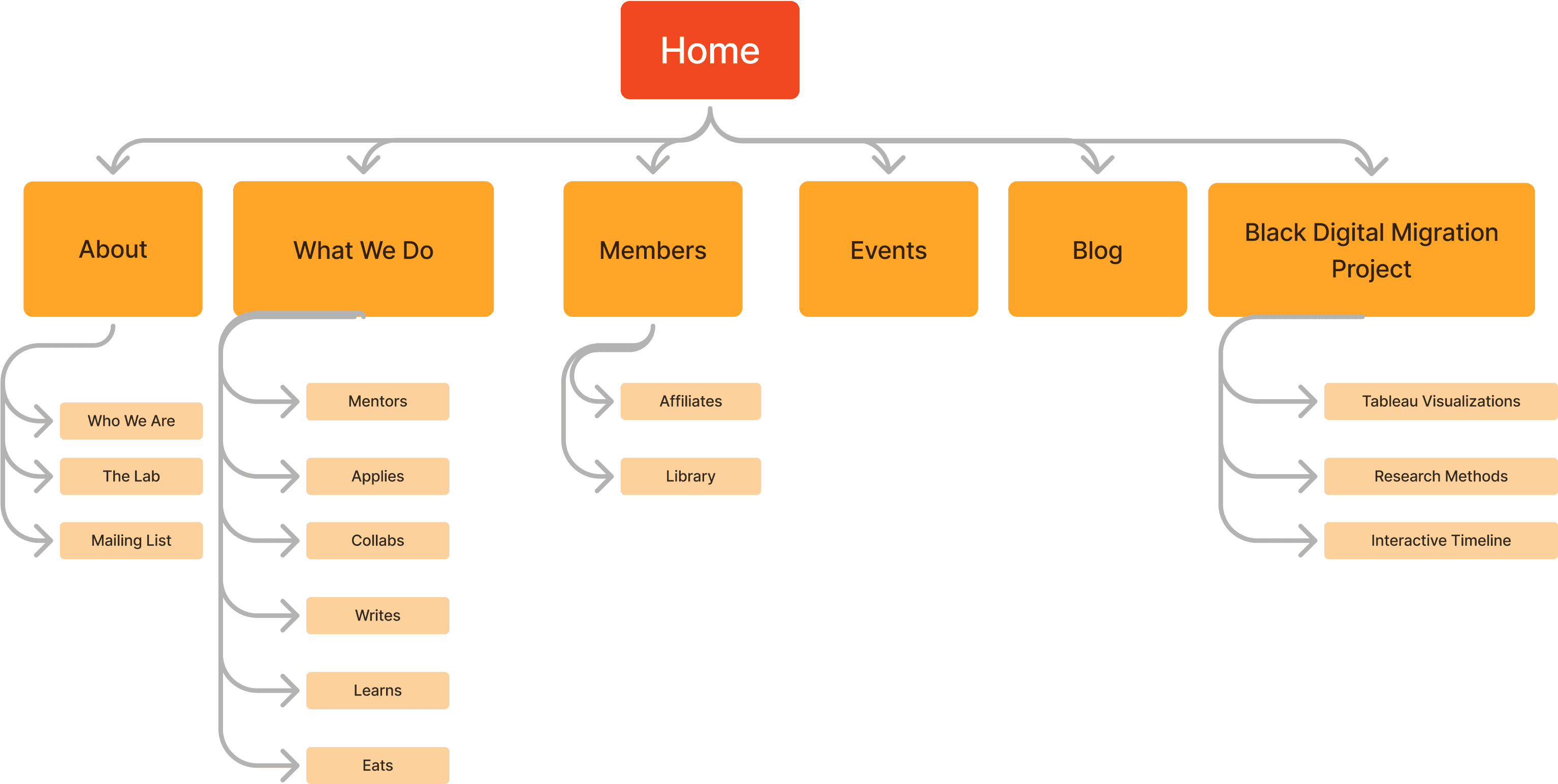
There are confusing sections and some categorizations overlap, making it harder for users to find the resources they need.
We decided to rename the sections to enhance clarity and strengthen the connection to our user's mental models.
New:
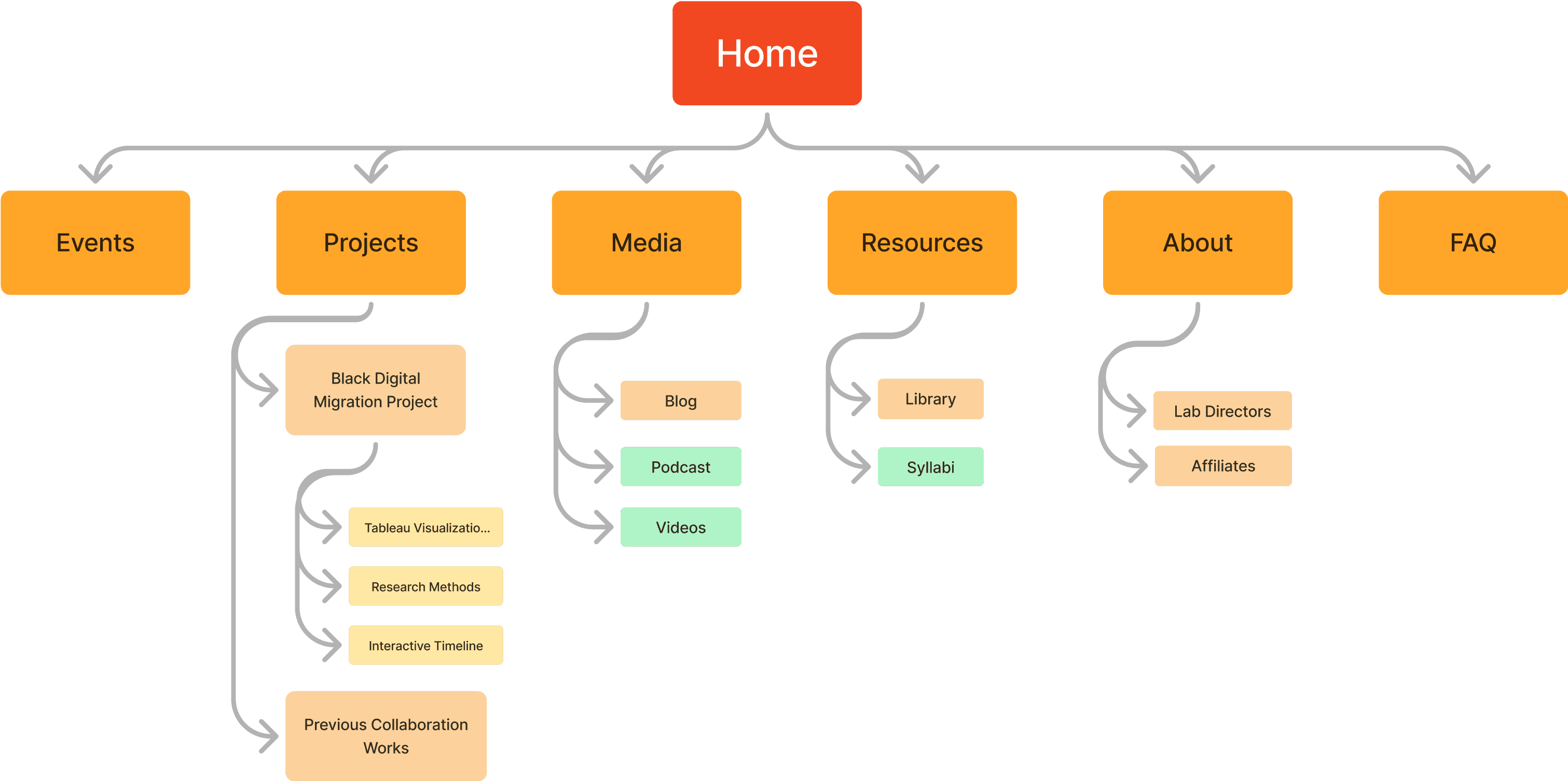
We have clearer header navigations and groupings to increase discoverability and findability.
Develop
Wireframes and design considerations
Low fidelity wireframes

Navigating design challenges throughout the site
DESIGN CONSIDERATIONS
How can we reduce unnecessary blank space?
In the old redesign, we had large images alongside the event information that would make pages excessively long. Additionally, there was no way to filter through or see a summary of upcoming events beyond subscribing to our Google Calendar. This made finding future events time consuming and arduous.
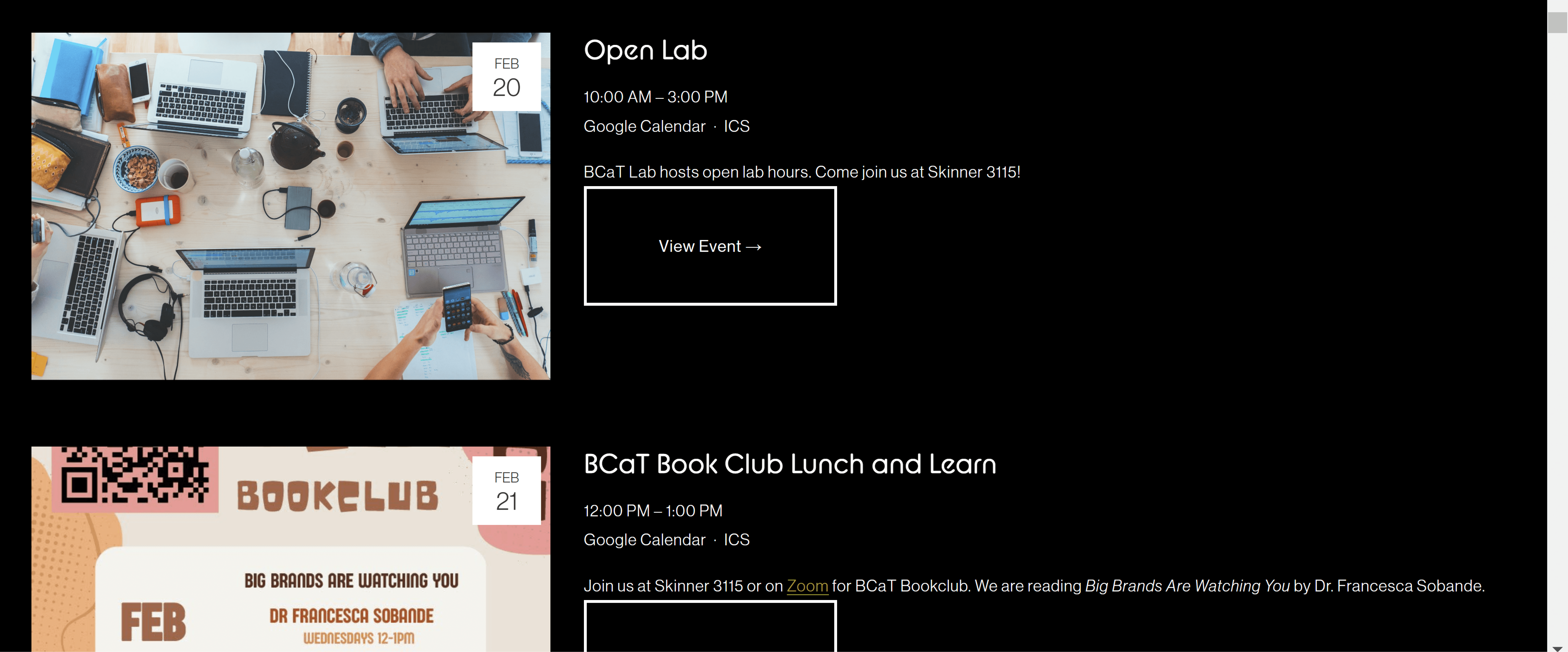
The old events page.
In my iterations, I opted to explore different ways we could display the events so that we could address these usability issues.
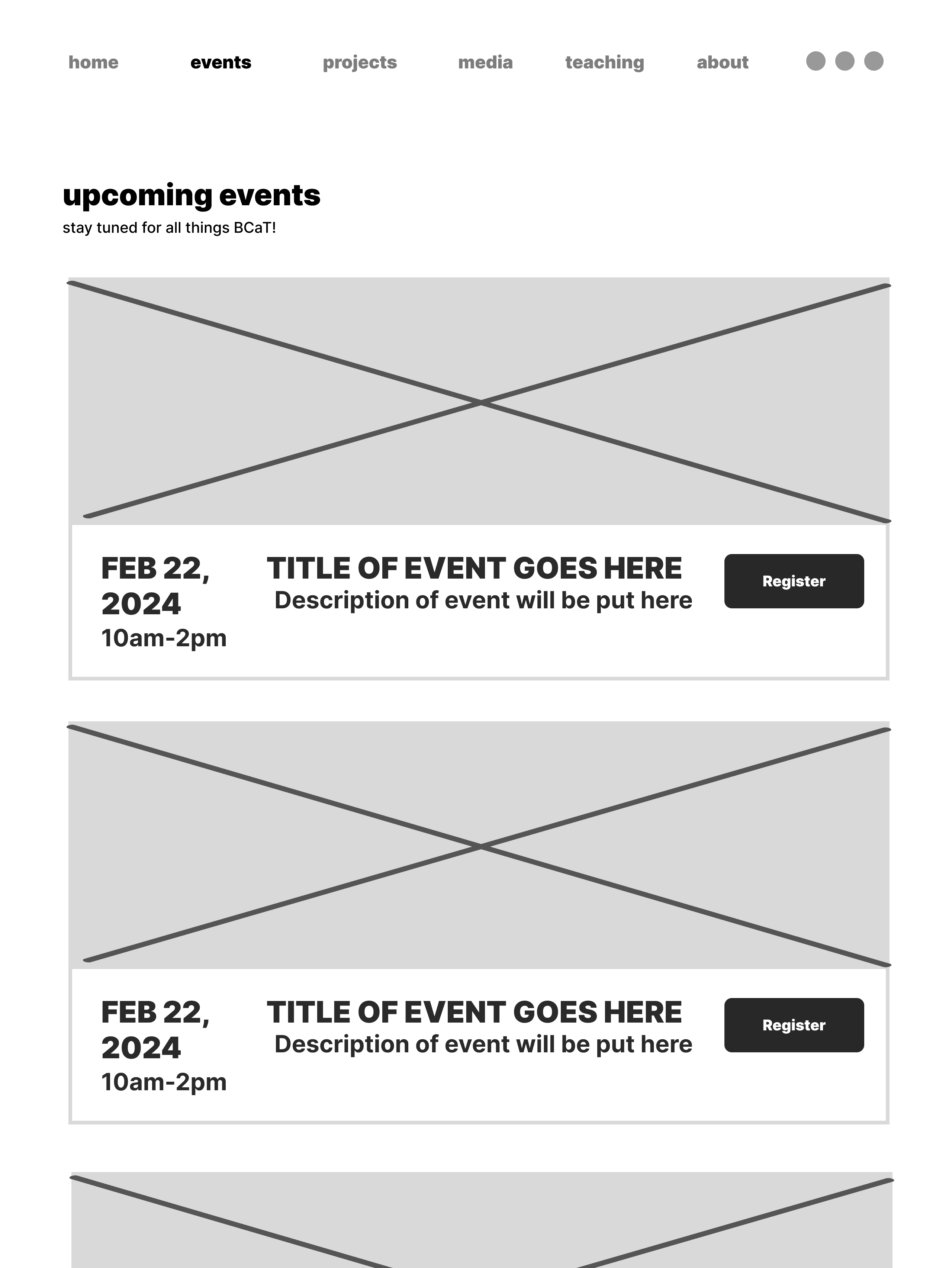
01 Horizontal + Detail Oriented
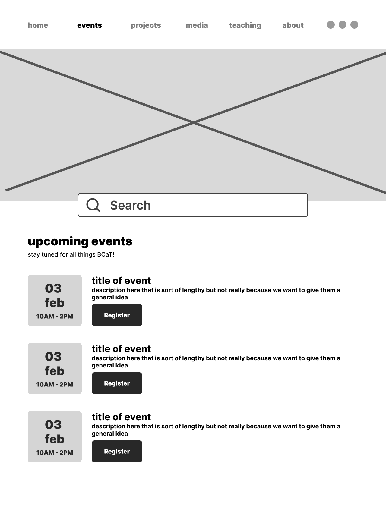
02 Horizontal + Photo
03 2 Columns
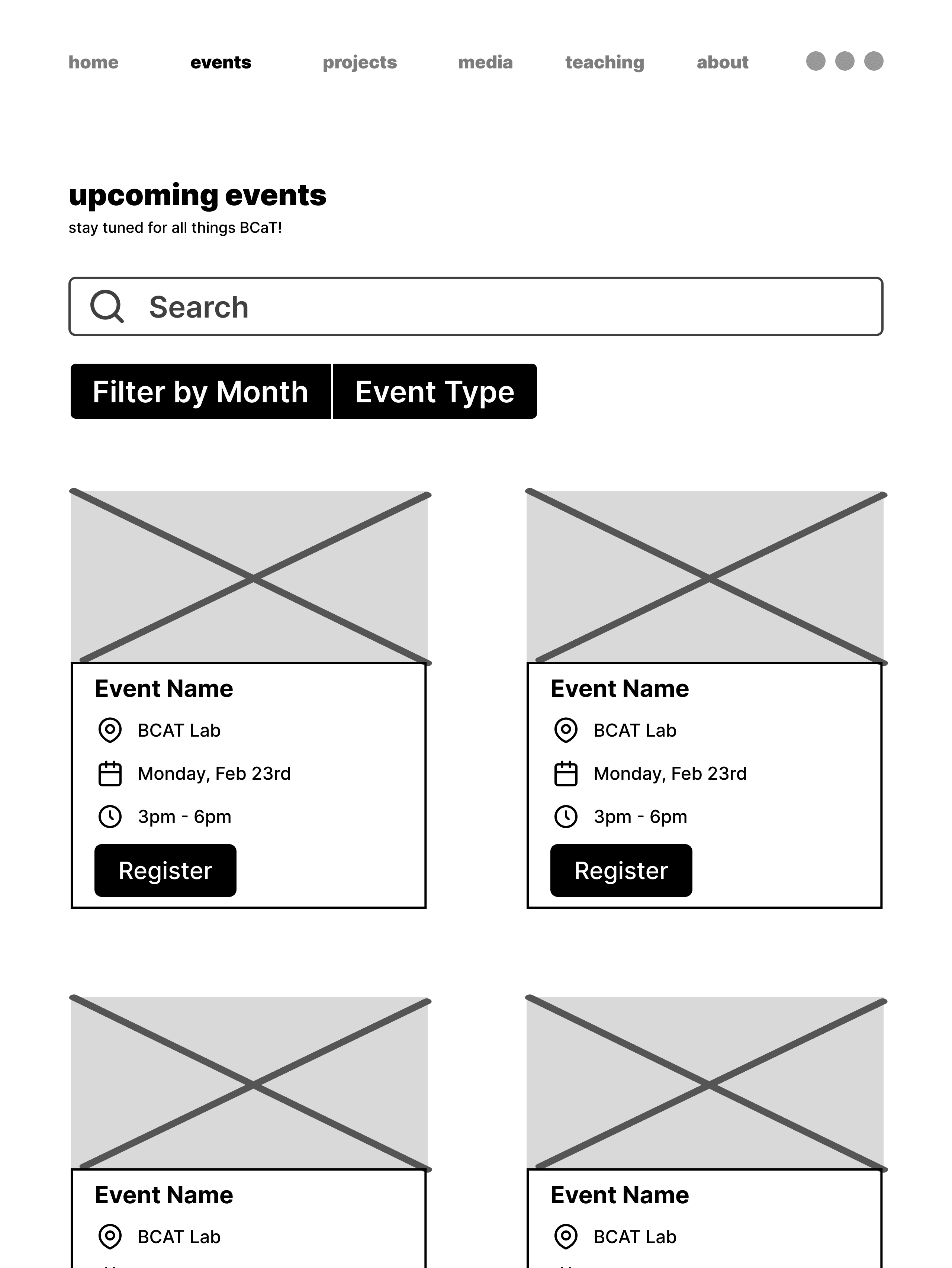
Different iterations of the Events page — we chose option #1!
01. Horizontal + Detail Oriented
There's a good sequential flow of events
You can see multiple events on the page
The banner image is too large and takes up unnecessary space.
02. Horizontal + Event Graphic
Images bring more excitement to an event, giving a glimpse into what to expect
The new graphic proportions would require additional labor
We can't fit multiple events in one scroll
03. 2 Columns + Event Graphic
Can fit more events at a time than option 2
The new graphic proportions would require additional labor
Readability concerns
Option 1 was the easiest in terms of readability and it allowed for the user to view multiple events at a time.
DESIGN CONSIDERATIONS
How can we improve event findability?
The old site didn't have a filter or search capability which made it hard to sift through the month's events. In my iterations, I opted to include search capabilities at the top of the page.
However, after talking with the directors and testing technical constraints, we found that a calendar that listed the events at the top of the page would be succinct and clearer to users.
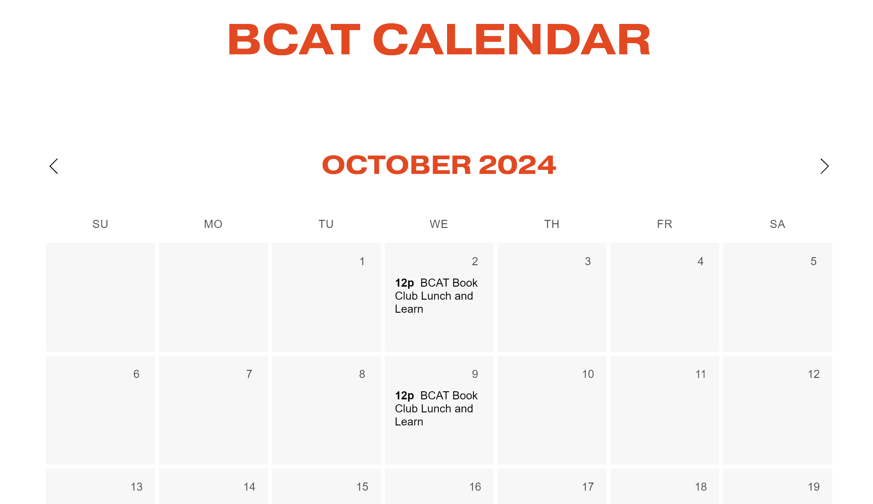
To make up for the lack of searchability on the page, I added a calendar to give an overview of the month's events.
Deliver
The new and improved Black Communication and Technology Lab!
After consulting with stakeholders, I was able to make some small refinements and finalize the designs! Introducing the BCaT redesign:
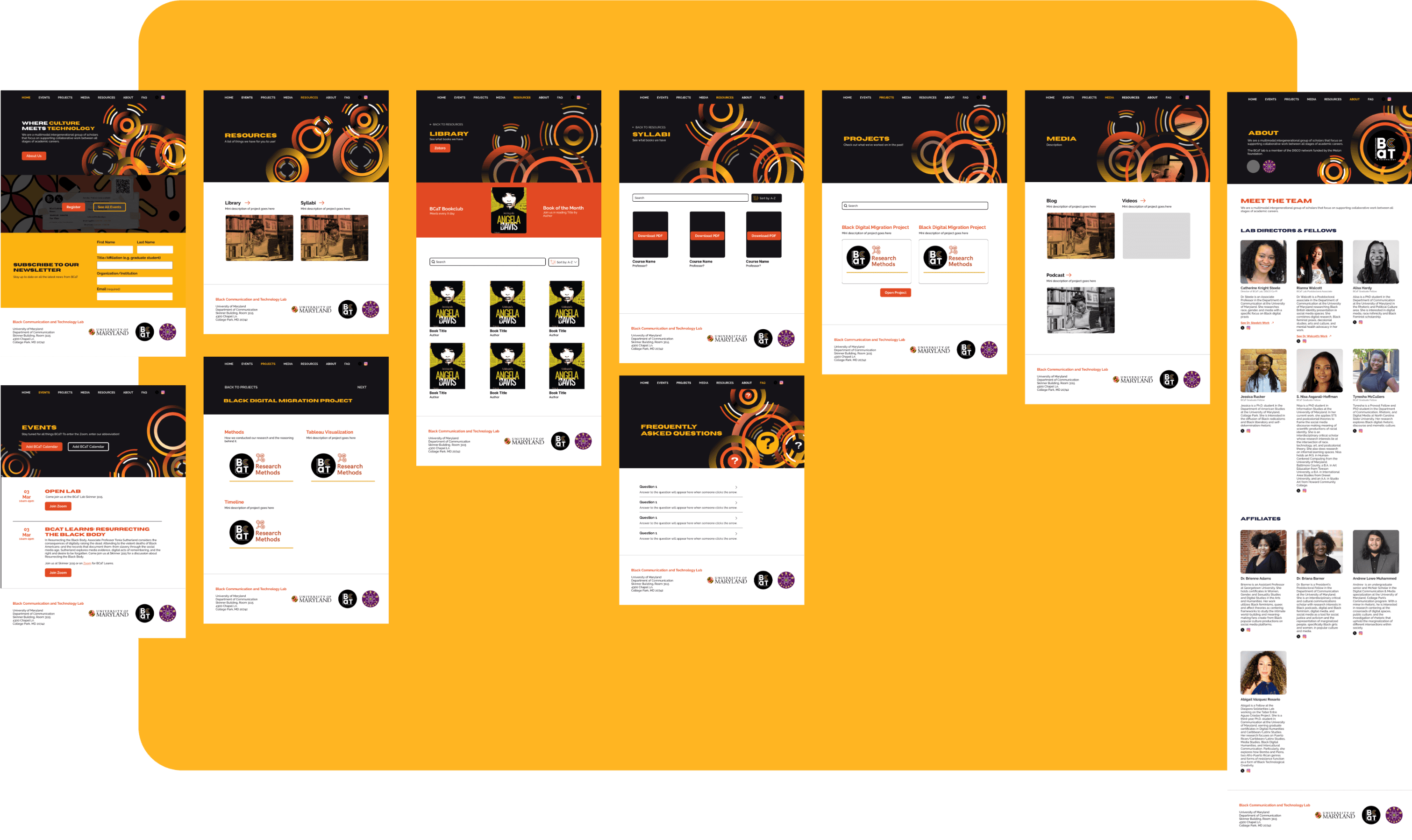
Redesign of the Home, About, FAQ, Projects, Resources, Media and Library pages
FEEDBACK
All of the directors were satisfied with the site enhancements!
After doing incremental check-ins and handoffs, the directors were fully on board with the site redesign and felt like it developed BCaT's brand to the next level.
TRANSFERRING TO HOST SITE
Since the organization hosts their site on Squarespace, I had to transfer my designs from Figma.
Due to technical constraints, some of the final designs had to be modified to accommodate Squarespace's capabilities.
!
Want to see the current site? Click here!
Next Steps
What's on the roadmap for next semester?
Doing further user testing to improve consistency, usability, and improve SEO
FALL 2024
In September 2024, we conducted 2 usability tests with coordinators from our partner— the DISCO Network! October and November will be spent addressing the feedback we received.
We uncovered pivotal opportunities to bridge consistencies between the two organizations in terms of tone and site layout. Stay tuned for the upcoming site changes and iterations :)